4.1 Colour Palettes for Gallery Spaces
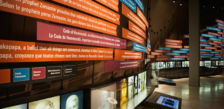
We choose materials and colours for the Museum’s gallery spaces that create a comfortable and safe-space setting. Neutral tones of black, white and flat warm greys predominate in exhibit areas for images and artefacts (see Figure x). To create a visual hierarchy in gallery spaces, we also use rich colours. The Museum strives to use bright colours to denote content and grey-based palettes for background aesthetics.
Black and White for Clarity and Contrast
-
Pantone®: Black
CMYK: 00 00 00 100
RGB: 000 000 000
Hex: 000000
-
Pantone®: white
CMYK: 00 00 00 00
RGB: 255 255 255
Hex: ffffff
Flat Warm Greys for Nuance and Warmth
-
Pantone®: 412
CMYK: 52 59 45 90
RGB: 056 047 045
Hex: 382F2D
-
Pantone®: Warm Gray 11
CMYK: 26 36 38 68
RGB: 110 098 089
Hex: 6E6259
-
Pantone®: Warm Gray 7
CMYK: 16 23 23 44
RGB: 150 140 131
Hex: 968C83
-
Pantone®: Warm Gray 2
CMYK: 06 07 10 11
RGB: 203 196 188
Hex: CBC4BC
Rich Colours for Emphasis and Highlights
-
Pantone®: 1645
CMYK: 00 80 75 00
RGB: 255 111 65
Hex: FF6F41
-
Pantone®: 115
CMYK: 00 14 100 00
RGB: 255 205 000
Hex: FFCD00
-
Pantone®: 143
CMYK: 00 32 87 00
RGB: 241 180 052
Hex: F1B434
-
Pantone®: 1245
CMYK: 06 35 99 18
RGB: 198 146 020
Hex: C69214
-
Pantone®: 7717
CMYK: 96 00 47 19
RGB: 000 133 125
Hex: 00857d
-
Pantone®: 632
CMYK: 83 92 15 07
RGB: 000 147 178
Hex: 0093B2
-
Pantone®: 7462
CMYK: 100 48 06 30
RGB: 000 085 140
Hex: 00558C
-
Pantone®: 272
CMYK: 61 56 00 00
RGB: 116 116 193
Hex: 7474C1