5.2 Typefaces
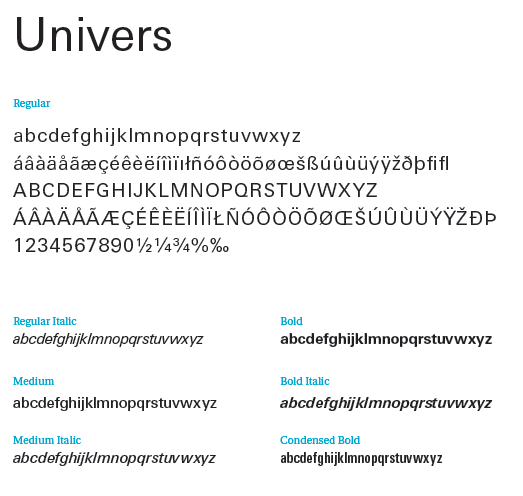
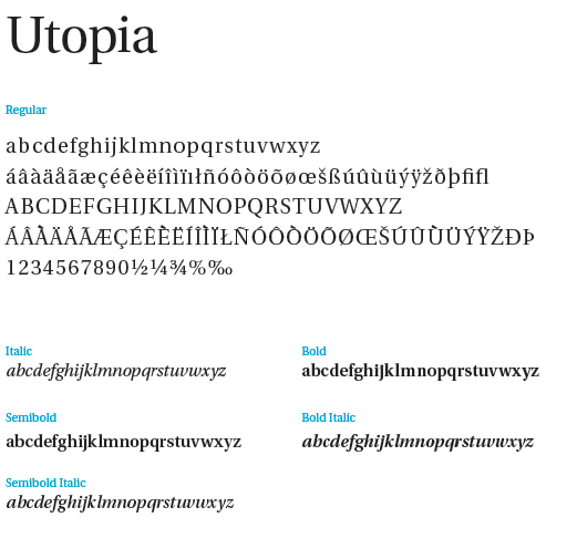
The two main typefaces used for exhibit text are Univers (primary) and Utopia (secondary), a serif and a sans-serif font, respectively. Simple serif and sans-serif typefaces, such as Utopia and Univers, provide the best legibility for people who have low vision, language problems or cognitive disabilities. In addition, Univers and Utopia provide the following accessibility characteristics:
- proportions that contribute to legibility
- clear extension for lowercase letters
- easily legible numbers
These characteristics as they apply to text appearing in gallery space walls and exhibitry are described in more detail under the Text Hierarchy and Readability section of this guide.
Univers
This humanist sans-serif typeface is known for its clarity and utility, as it is equally suited for both small- and large-text display and comprises 63 fonts. In addition to the basic Latin alphabet, the Utopia family also contains Cyrillic and Arabic characters, allowing support to over 60 languages (see Figure 5.2.1).

Utopia
This contemporary serif typeface comprises 43 fonts for use in a wide range of applications and sizes. In addition to the basic Latin alphabet, extensions of the Utopia typeface contain Cyrillic and Vietnamese characters, allowing Utopia to provide support for more than 46 languages (see Figure 5.2.2).
