5.3 Type Anatomy
Type anatomy affects the readability and legibility of text. The proportions of font width, x-height and weight are key factors that make it easier to decipher and read letters and numbers.
The Utopia and Univers typefaces meet the following proportions for accessibility:
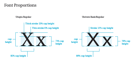
Type Proportions
Both Utopia and Univers meet the following type proportion requirements for readability (see Figure 5.3.1).
- Width – The percentage of width to height of the uppercase X should be 65%-95%.
- X-height – The percentage of the height of the lower case x to the uppercase X should be 65%-75%.
- Weight – The percentage of width of the vertical stroke of the lowercase h to the height of the - uppercase X should be 10%-15%.
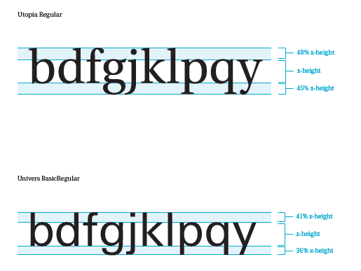
Clear Extension for Lowercase Letters
Distinct ascenders and descenders for the following lowercase letters are required for accessibility: b, d, f, g, j, k l, p, q, t, y.
Both Utopia and Univers meet these requirements (see Figure 5.3.2).
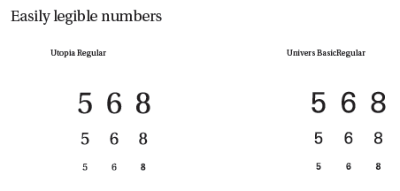
Easily Legible Numbers
The numbers 5, 6 and 8 are the most difficult to distinguish and read in less accessible typefaces. All numbers are legible in both the Utopia and Univers typefaces (see Figure 5.3.3).