4.5 Physical Design Standards
All of our built exhibits are manufactured for ease of use and visitor safety. We use interior design standards as well as national, provincial and municipal accessibility design standards as a starting point to determine heights, widths, reach distances and general design requirements for exhibits. We then prototype the exhibits to test our designs.
Our tables and surfaces allow for standing use as well as seated use where visitors are meant to engage with content at a close proximity. For areas with built-in seating, we create at least one designated location for individuals using a wheelchair. We also provide clear space under tables and surfaces for those using a wheelchair to pull into.
We ensure that all corners and edges are rounded and shaped to prevent sharp pressure points. There are clean surfaces under tables and surfaces to prevent the danger of protrusions.
All tables and surfaces are built off of an accessible path of travel, allowing for both clear space of not less than 915mm and a forward approach.
We use formaldehyde-free and low- and no-VOC (volatile organic compound) products whenever possible. We also use hypoallergenic materials for our Universal Keypad buttons and any hardware the visitor might use.
Circulation Routes in Gallery, Public, and Other Building Spaces
Gallery spaces are open and barrier-free, giving visitors, including those using wheelchairs or strollers, an unobstructed and a fully accessible circulation route from one gallery to the next. The vast majority of gallery flooring is polished concrete, allowing for ease of movement for visitors using wheelchairs or strollers. In discrete areas we have used other smooth floor surfaces such as linoleum, wood and extra low-pile carpeting. Where flooring changes are necessary, low profile transition strips and eased transitions of not more than a 1:12 grade or slope have been created.
In the exhibitions, we aim to provide a minimum of 1 metre for thresholds and 1.2 metres for pathways.
Multiple entrance and exit points in all gallery levels allow visitors to easily leave and enter galleries and control the route they wish to take.
Cane rails are installed where canted walls lean into gallery/public spaces.
For more details about ease of passage and movement related to vitrines and built exhibits, see the Vitrines and Built Exhibit section of this guide.
Seating
We provide accessible seating in all gallery and public spaces, offering a choice of bench seating and seating with backs and arms. Lightweight, movable seating and step stools are also available in all gallery spaces.
Universal Access Points
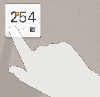
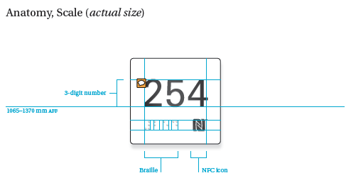
All static exhibition content as well as audio tours can be accessed via the CMHR’s Universal Access Points (UAPs) (see Figures 4.5.3 and 4.5.4). UAPs are a system of four components located at strategic points throughout exhibit areas on walls and exhibit panels. The markers consist of a cane-detectable tactile floor strip, a high-contrast and tactile square plaque indicating a reference number in numerical digits and Braille, and a low-energy Bluetooth iBeacon.
Used in conjunction with the CMHR’s mobile application, UAPs link to audio files that describe the Museum’s static content (such as printed photos, artefacts and printed or built text); UAPs also provide access to supplemental interpretation and functionality. If a visitor does not have a Bluetooth enabled mobile device (and the CMHR mobile application), they can borrow one from Visitor Services.


UAPs are discussed in more detail in the Media Production Standards for Exhibits section of this guide.
Tactile Floor Markers
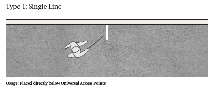
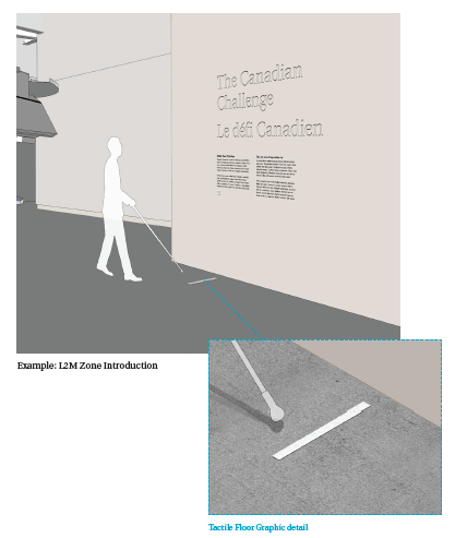
A system of tactile floor markers offers a physical means for visitors who navigate using a white cane to navigate and interact with the exhibitions throughout the Museum. The floor markers indicate the location and orientation of various exhibit cases or installations. They are perpendicular to exhibit cases or installations, directly below the related UAPs (see Figures 4.5.5 and 4.5.6).


Lighting of Circulation Route and Gallery Spaces
The circulation route is clearly defined and lit, never dropping below 50 lux (“lux” is the International Standard unit of illuminance), to ensure all visitors can progress easily through the gallery spaces, particularly those with visual and perceptual difficulties.
LED lights have been added to distinguish edges and corners that could pose a hazard in darker gallery spaces, such as under table corners and benches.
We provide a minimum of 100 lux throughout exhibits to ensure visitors with low vision can see all objects. Exceptions occur for material conservation reasons only. We assess exhibits to ensure that there is minimal to no glare from cases and on labels, regardless of whether visitors are viewing them from a standing or seated position. We also assess vitrine seams to ensure they do not conflict with standing and seated sightlines.